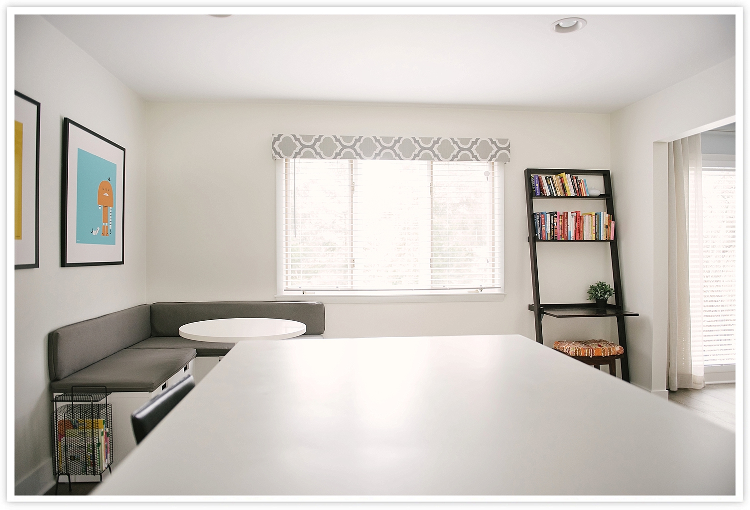
Our kitchen remodel was by far the biggest project that we took on in the whole house. We ended up moving out and living with my parents for four months while our house became a land of dust and construction (I’ll have to share more of the “in progress” photos later). I don’t think most people would recommend taking on a renovation like this during the first year of parenthood, but I’m glad we did it when we did. For more details on the renovation (budgeting, floor plans), check out our full feature in Houzz.
Also check out a few of the kitchens that inspired our finishes:
- Smitten Studio was the original inspiration for using IKEA cabinets with Semihandmade cabinet faces that we could paint.
- Jenna Sue Design Co. inspired the white subway tile and open shelving.
- We loved the dark contrasting island in this Houzz photo.
- We love the waterfall countertops in this Houzz photo (the waterfall countertops added time and expense to the project because they required extra materials and a special team, but it was completely worth it in the end, since this really sets the tone for the kitchen design).
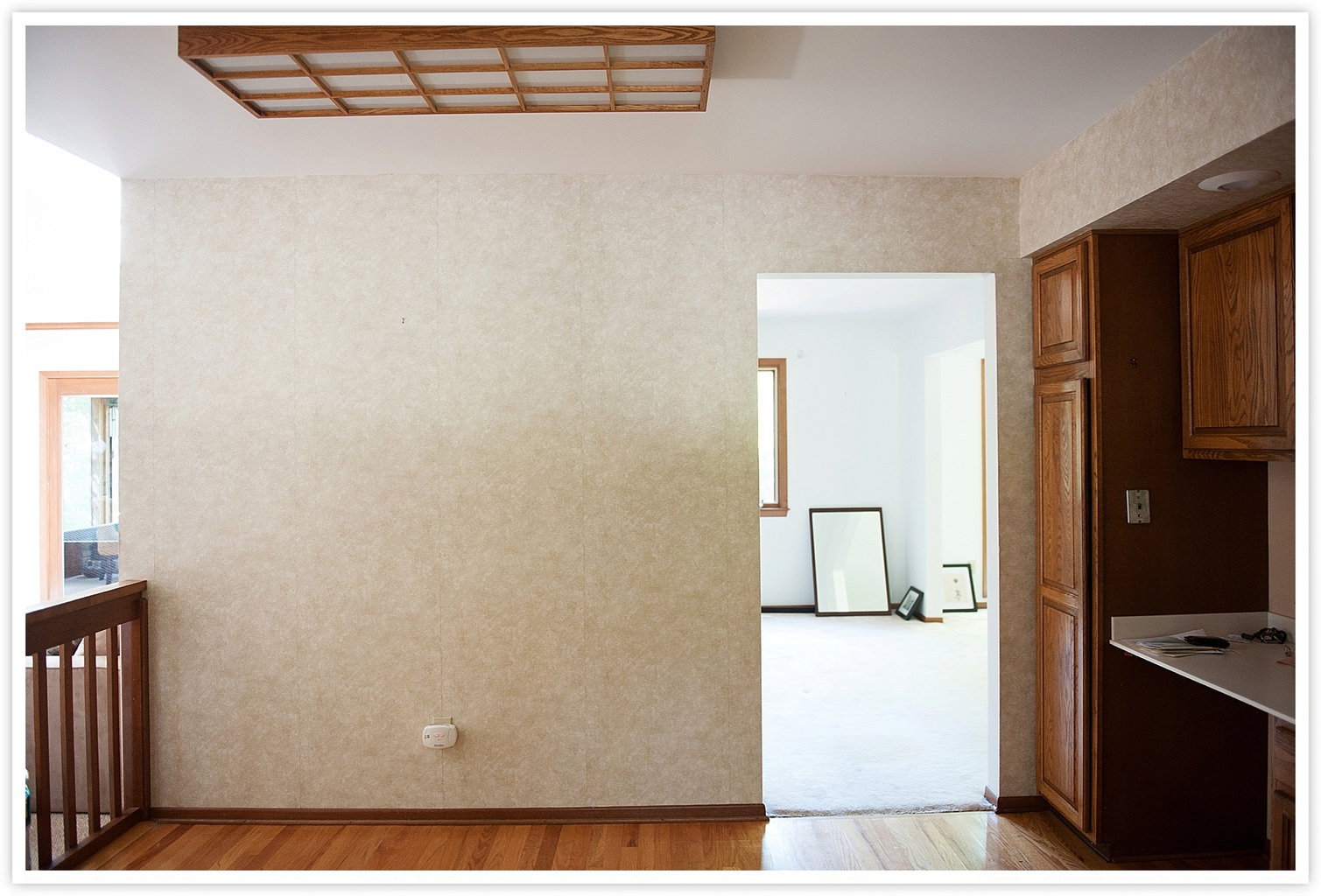
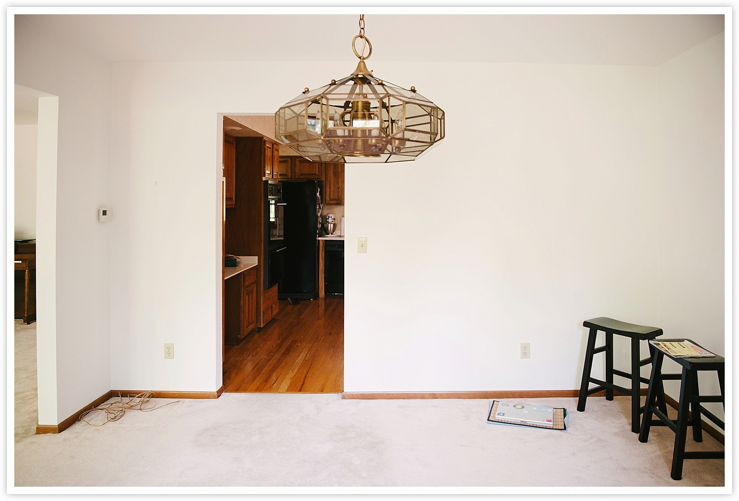
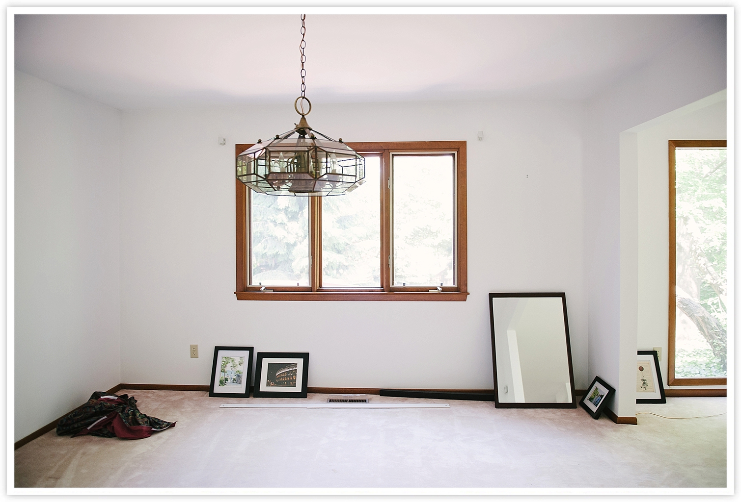
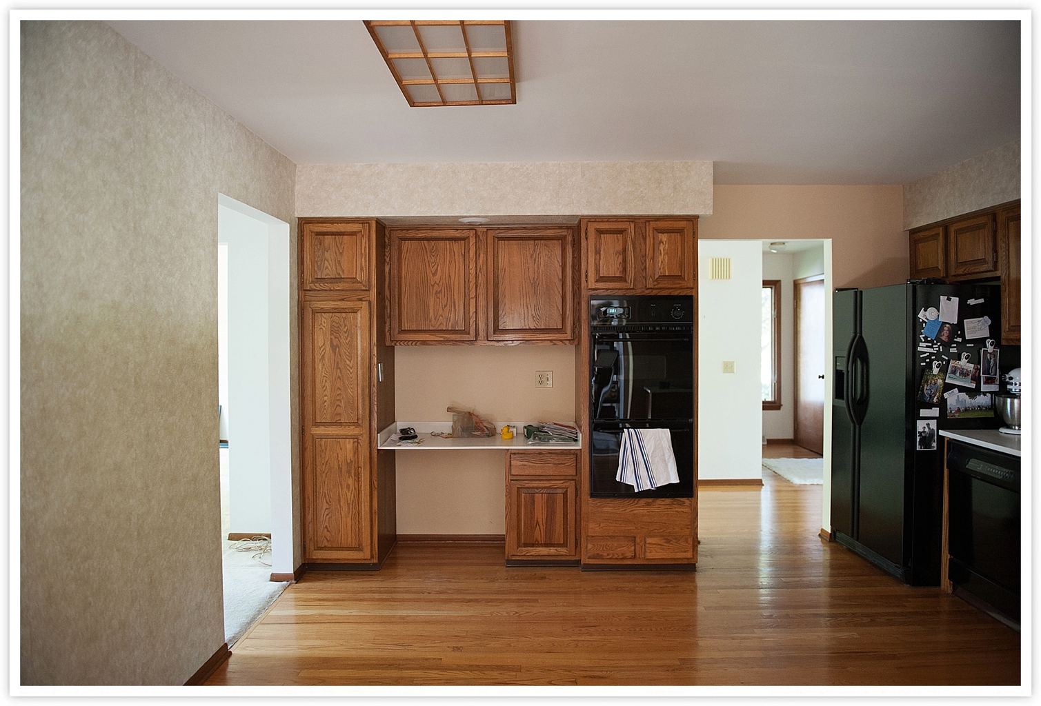
Before: We started with wallpaper, a horrible fluorescent light, wood cabinets and a severe lack of storage that led to cluttered counters. The one thing we did like was the clean white Corian countertops, which gave us more confidence when we chose this surface for our new 13 foot island.
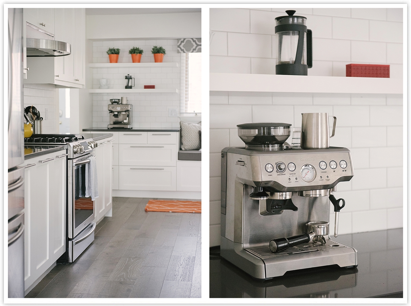
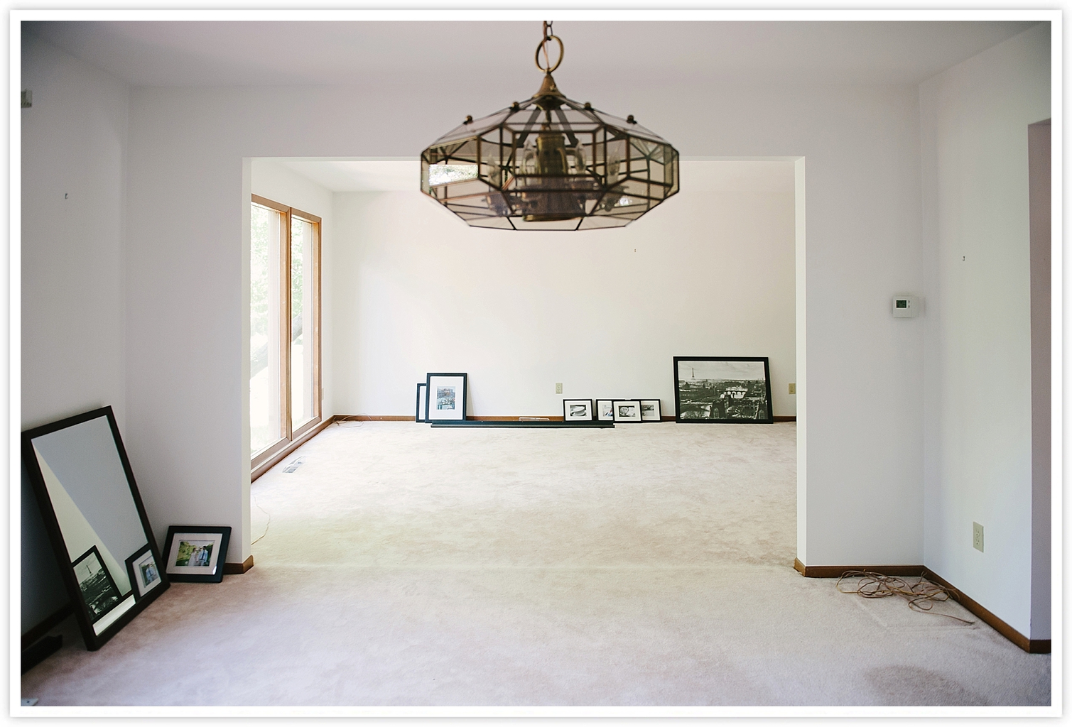
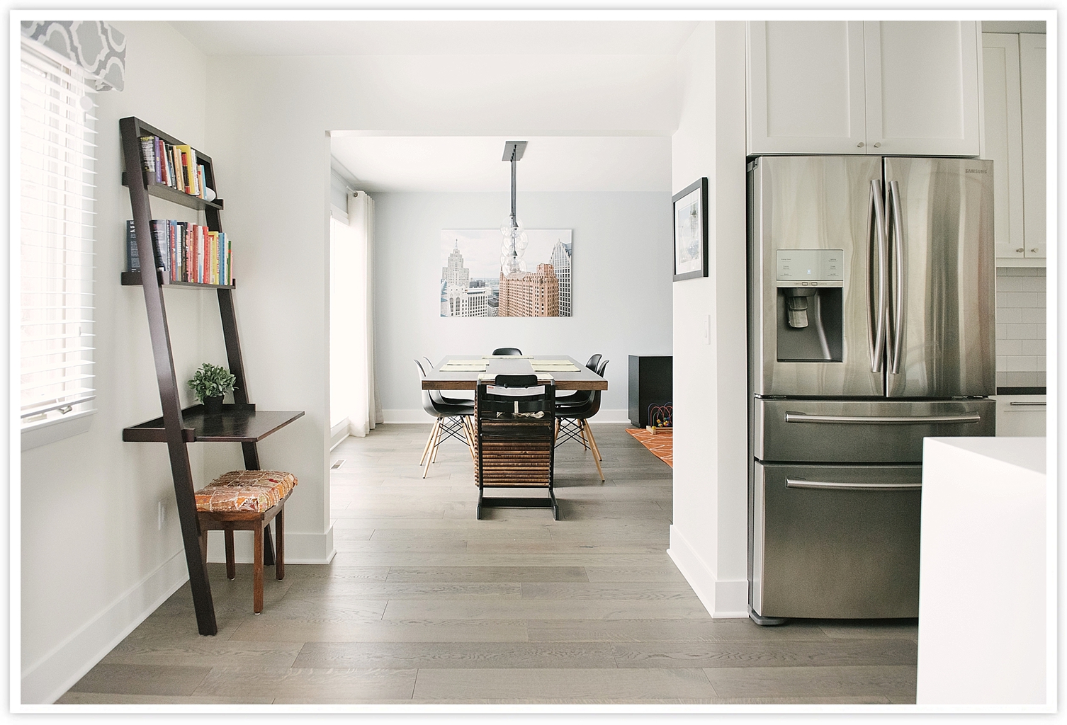
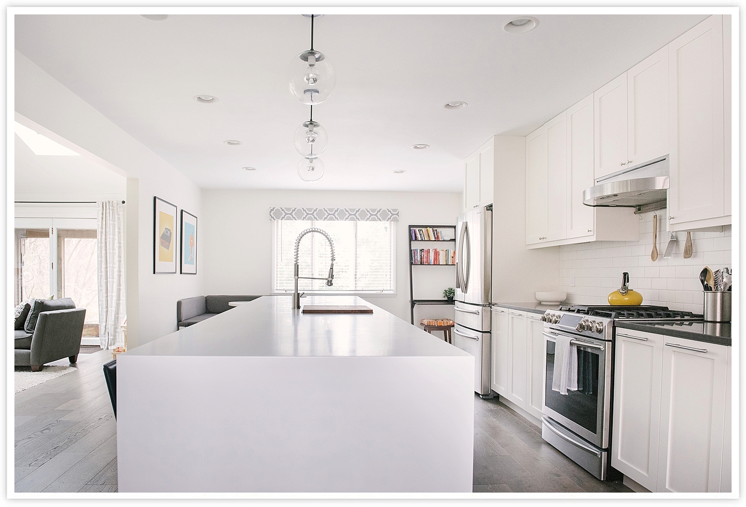
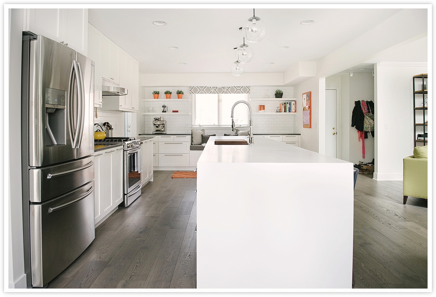
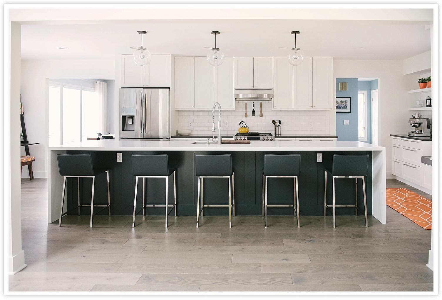
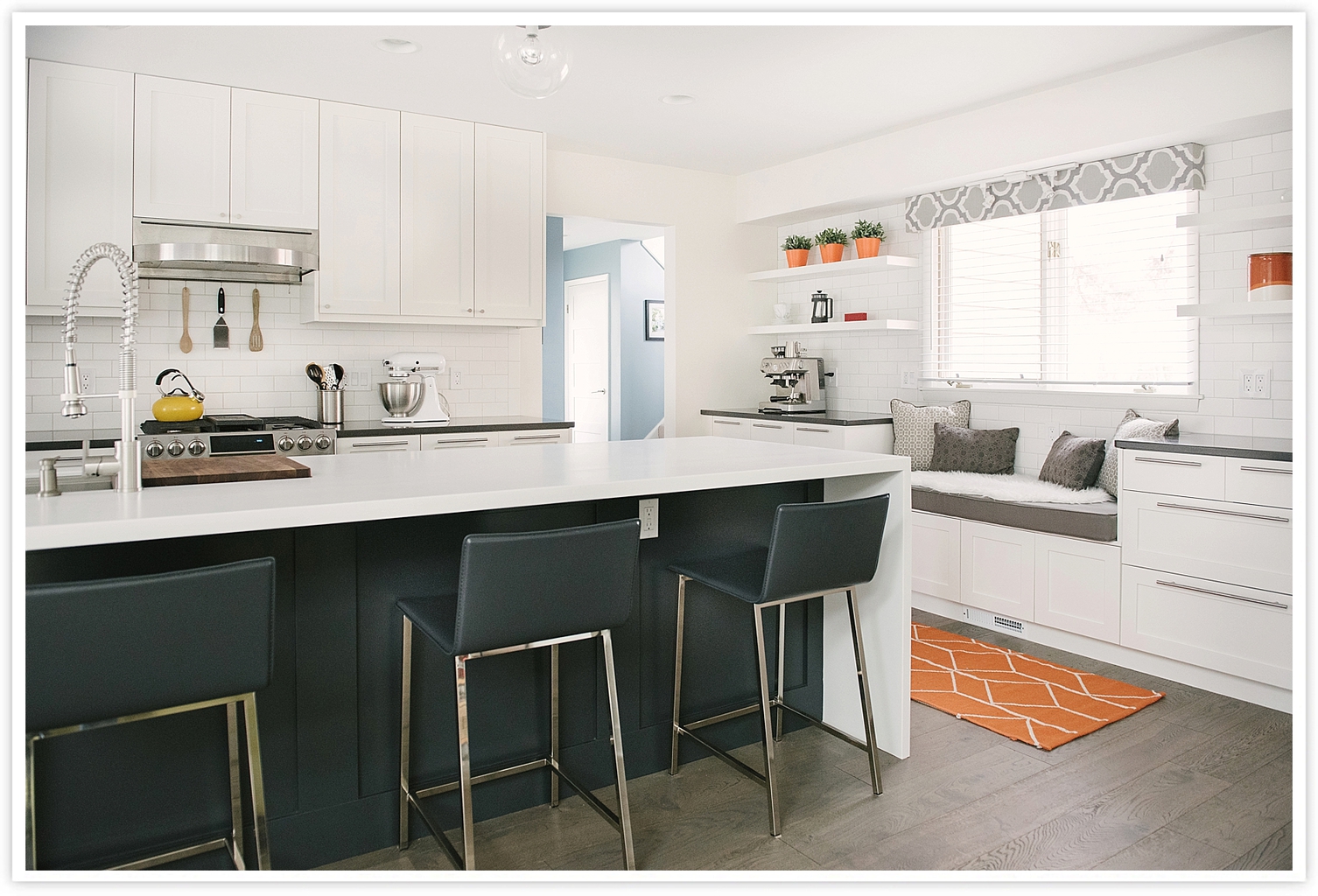
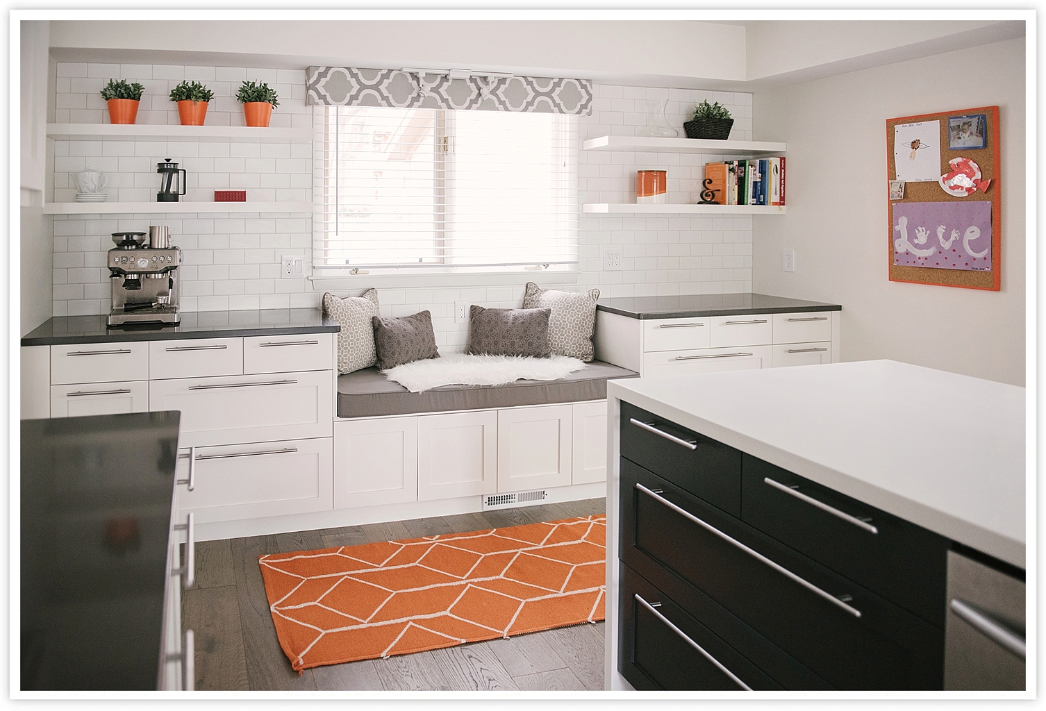
After: We knocked out the wall between the kitchen and dining room to create one big continuous space. We donated all of the old cabinets and appliances and bought new stainless steel appliances. We used IKEA for our base cabinets and DIY shaker Semihandmade cabinet doors that we painted Alabaster White (Sherwin Williams) on the perimeter and Cracked Pepper (Behr) on the island. The island is 13 feet long, and most granite and quartz options only come in 10 foot slabs, so we opted for Corian, which can essentially be melted together so that it’s seamless at any length. Corian also worked great for the waterfall edges on the countertops. View all sources at the bottom of this post.
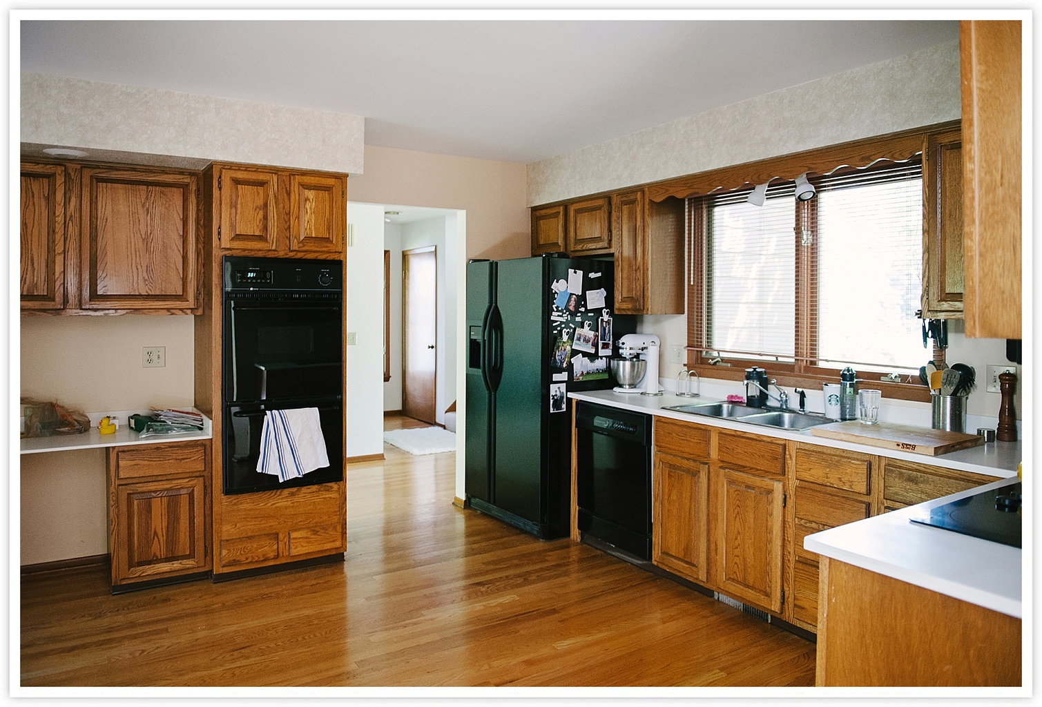
Before: Cluttered counters and THAT WOODEN SCALLOPING.
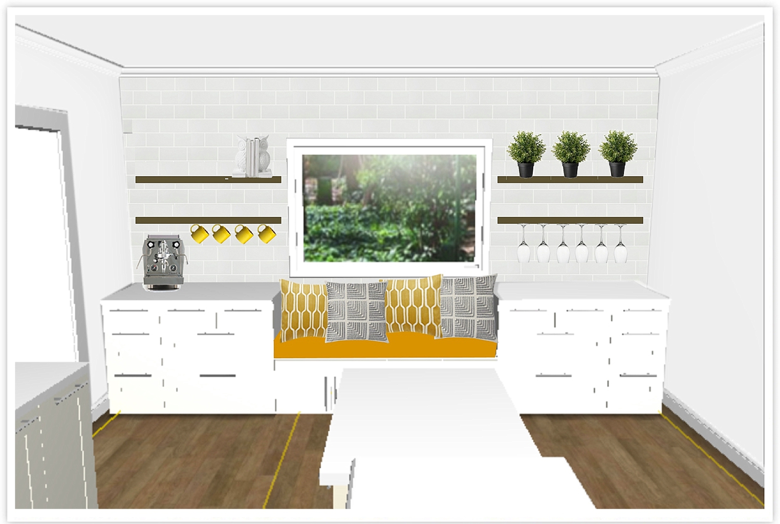
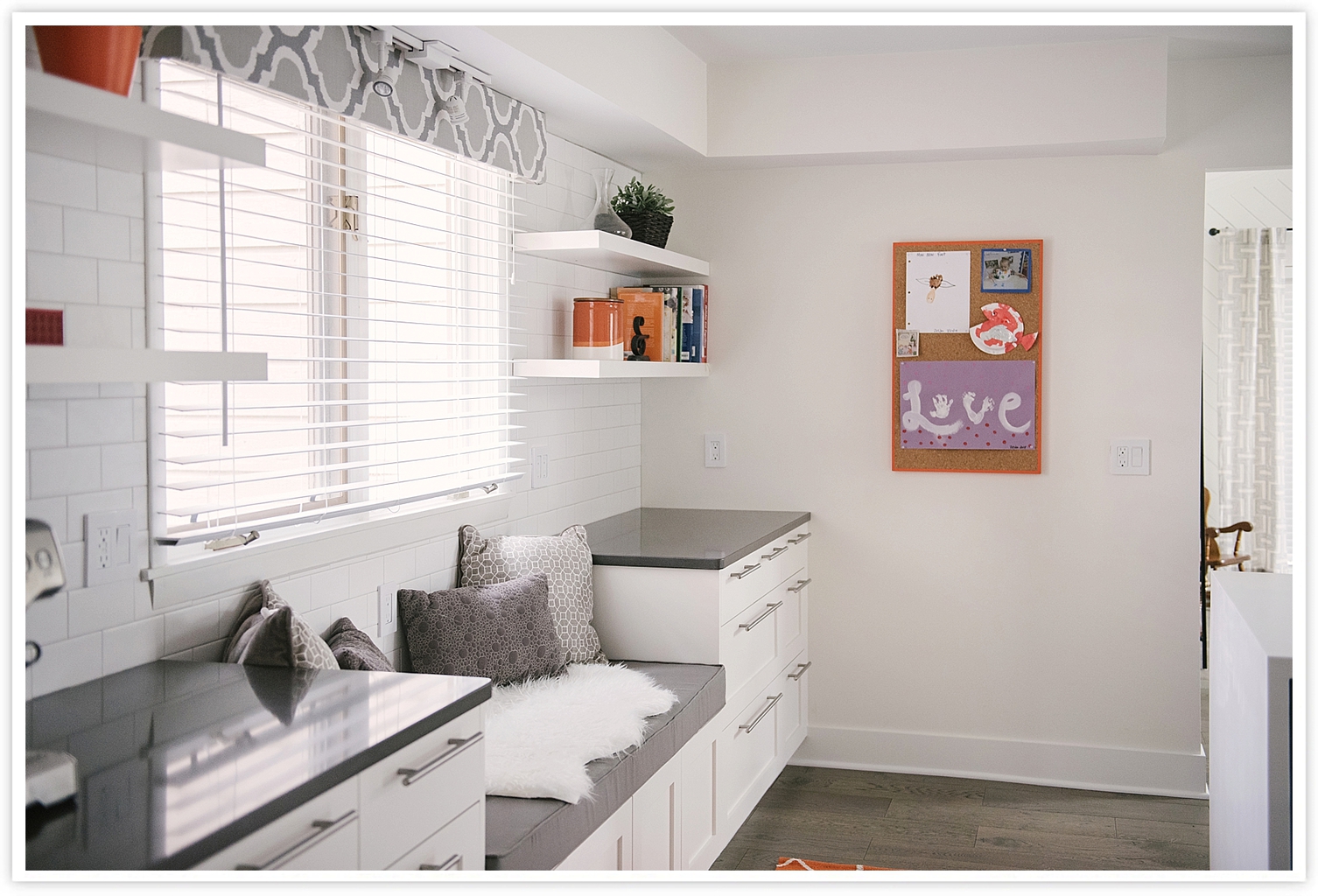
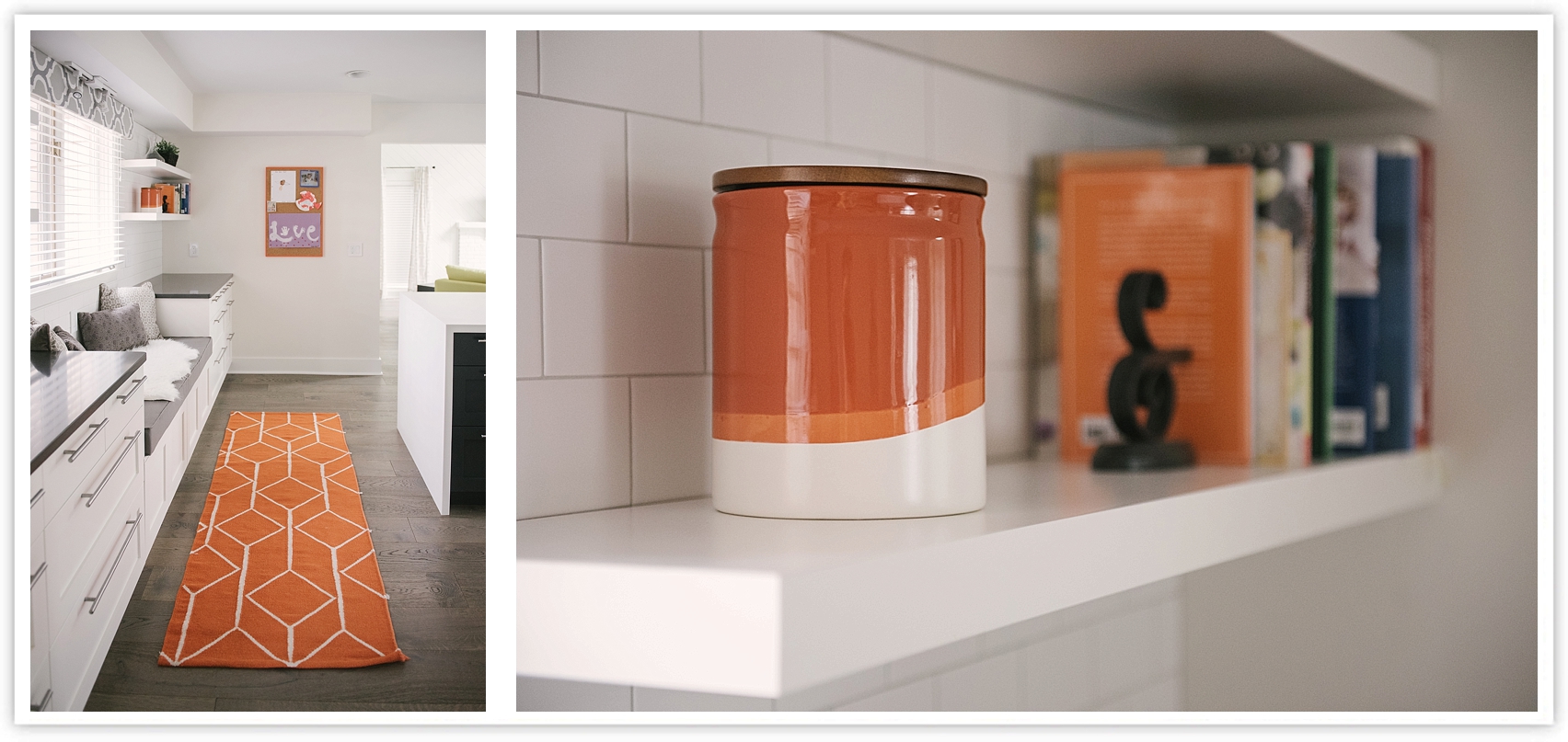
After: We moved the sink to the island and made the area under the window into a window seat. The cabinets that make up the window seat are actually top wall cabinets that are meant to go above the fridge. These were built onto the base frame with the other cabinets and reinforced with an extra layer of wood on top, then finished with a custom 4″ cushion from Cushion Source. This gives us an amazing amount of extra storage for toys on one side and our own work bags and office supplies on the other.
Here’s the initial mockup I created for this space using IKEA’s design software and a bit of Photoshop.
